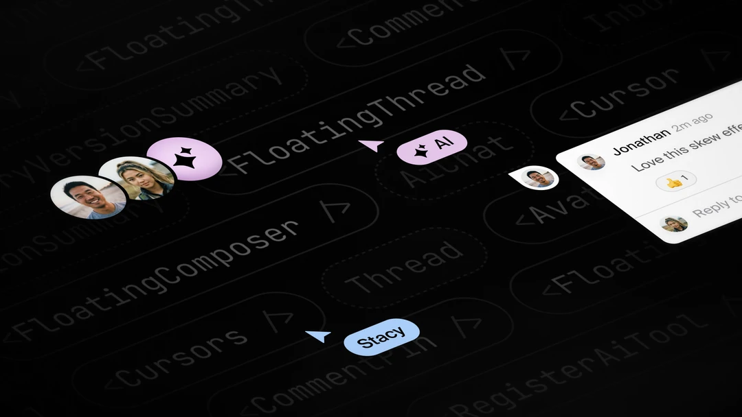
Today we’re introducing a new set of ready-made React components, designed to help you start integrating realtime collaboration into your product.
- <AvatarStack />: A realtime list of avatars representing connected users.
- <Cursors />: A set of realtime cursors for other users in the room.
- <Cursor />: A single customizable cursor component.
- <CommentPin />: An avatar pin useful for toggling pop-up threads.
- <FloatingComposer />: A pop-up composer for creating threads.
- <FloatingThread />: A pop-up comment thread.
Additionally, we’ve written a new set of Next.js get started guides to help you use them in various scenarios.
- Draggable comments: Add a 2D canvas of draggable comments.
- Table comments: Add pop-up comments to your AG Grid or HTML table.
- Presence: Add live cursors and avatar stacks to your product.
Components
<AvatarStack />
Displays an overlapping stack of avatars representing users currently present in the room. It updates in realtime as users connect and disconnect.
import { AvatarStack } from "@liveblocks/react-ui";
function Component() {  return (    <AvatarStack max={4} size={48} />  );}
Features
- Pop-up username when hovering over an avatar.
- Define how many avatars should be shown before grouping the rest.
- Optionally add offline users to the stack, such as those previously connected.
Learn more in our documentation: AvatarStack.
<Cursors />
Displays a realtime multiplayer cursor for every other user connected to the room.
Mislav
Charlie
import { Cursors } from "@liveblocks/react-ui";
function Component() {  return (    <Cursors>      <YourCanvas />    </Cursors>  );};
Features
- Smooth movement using spring interpolation.
- Cursors positioned relative to their container using percentage coordinates.
- Avoids performance bottlenecks caused by re-renders and layout thrashing.
Learn more in our documentation: Cursors.
<Cursor />
Displays a styled multiplayer cursor, helpful for building custom realtime cursors with useOthers.
Charlie
import { Cursor } from "@liveblocks/react-ui";
function Component() {  return (    <Cursor label="Charlie" color="#e8d930" />  );};
Features
- Customizable background color and label.
- Text color is automatically adjusted to contrast with the background color.
- Has a height and width of
0pxmaking it easy to position accurately.
Learn more in our documentation: Cursor.
<CommentPin />
Displays a comment pin that can be used anywhere in your UI, or as a trigger to open pop-up threads.
import { CommentPin } from "@liveblocks/react-ui";
function Component() {  return (    <CommentPin      userId="nova-ai"      size="48px"      corner="bottom-left"    />  );};
Features
- Displays an avatar inside the pin when
userIdis provided. - Define which corner the pin should point to, such as
"top-left". - Can be used as a trigger for
FloatingComposerandFloatingThread.
<FloatingComposer />
Displays a floating thread composer alongside a trigger element, such as a button. Clicking the trigger opens the composer, and clicking outside closes it.
import { FloatingComposer } from "@liveblocks/react-ui";
function Component() {  return (    <FloatingComposer      side="bottom"      align="center"      sideOffset={12}      alignOffset={0}    >      <button>Trigger</button>    </FloatingComposer>  );};
Features
- Use any React component as a trigger or opt for our pre-built
CommentPin. - Define positioning, offset, and alignment relative to the trigger.
- Combine with
FloatingThreadto display the created thread.
Learn more in our documentation: FloatingComposer.
<FloatingThread />
Displays a floating comment thread alongside a trigger element, such as a button. Clicking the trigger opens the thread, and clicking outside closes it.
import { FloatingThread } from "@liveblocks/react-ui";
function Component() {  return (    <FloatingThread      thread={thread}      side="bottom"      align="center"      sideOffset={12}      alignOffset={0}    >      <button>Trigger</button>    </FloatingThread>  );};
Features
- Use any React component as a trigger or opt for our pre-built
CommentPin. - Define positioning, offset, and alignment relative to the trigger.
- Combine with
FloatingComposerto display a composer to create a thread.
Learn more in our documentation: FloatingThread.
Use cases
Draggable comments
Using FloatingThread and CommentPin together, you can create a canvas-like UI with draggable comment pins, like in the live demo below.
https://nextjs-comments-canvas.liveblocks.app/?exampleId=xPF2kItY4eSeiXo&examplePreview=0
Our Next.js Canvas Comments example
This works by taking x and y coordinates for each thread, storing them on thread metadata, and then using them to position the comment pin. CommentPin works as the trigger for each FloatingThread.
function DraggableComments() {  const { threads } = useThreads();
  return threads.map((thread) => (    <FloatingThread key={thread.id} thread={thread}>      <CommentPin        userId={thread.comments[0]?.userId}        style={{          position: "absolute",          left: thread.metadata.x,          top: thread.metadata.y,        }}      />    </FloatingThread>  ));}
Learn how to get started with draggable comments in Next.js.
Table comments
By adding FloatingComposer and FloatingThread to a table you can enable users to leave comments on individual cells.
https://nextjs-comments-ag-grid.liveblocks.app/?exampleId=xPF2kItY4eSeiXo&examplePreview=0
Our Next.js Comments AG Grid example
Each cell is passed a rowId and columnId which is used in thread metadata to render comments attached the cell using FloatingThread. If a thread isn’t found for the cell, then FloatingComposer is displayed, allowing the user to create a new thread with this metadata.
function TableCellComment({ threads, rowId, columnId }) {  const thread = threads.find(    ({ metadata }) => metadata.rowId === rowId && metadata.columnId === columnId  );
  if (!thread) {    return (      <FloatingComposer metadata={{ rowId, columnId }}>        <button>➕ Add comment</button>      </FloatingComposer>    );  }
  return (    <FloatingThread thread={thread}>      <img src={thread.comments[0]?.userId} alt="User avatar" />    </FloatingThread>  );}
Learn how to get started with commenting in HTML tables and AG Grid.
Presence
Using AvatarStack and Cursors together, you can create real live presence in your product.
https://nextjs-live-avatars.liveblocks.app/?exampleId=xPF2kItY4eSeiXo&examplePreview=0
Our Next.js Live Avatars example.
This works by setting up user authentication then simply importing the components, wrapping your main content within Cursors.
function Layout({ children }) { return ( <div> <header> Untitled document <AvatarStack max={3} size={32} /> </header> <main> <Cursors>{children}</Cursors> </main> </div> );}Learn how to get started with presence in Next.js.
Upgrade
To use the latest features, update your packages with the following command.
npx liveblocks upgradeIf you were previously on Liveblocks 3.10 or below, make sure to follow our upgrade guides before updating.